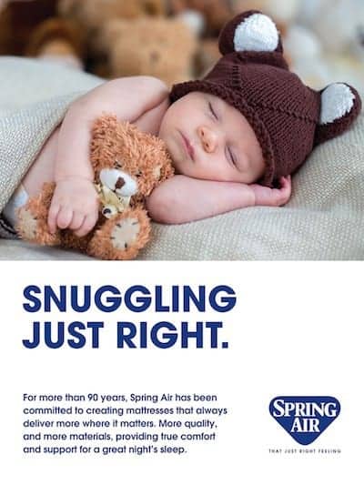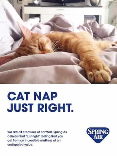
Spring Air International’s new marketing campaign features images such as this “Drool Worthy” sleeping baby and this snoozing orange tabby cat.

All advertising and collateral material, including retail store signage, will focus on the Spring Air brand and feature candid lifestyle photography “of real people, not airbrushed models,” said Spring Air President Nick Bates, noting there won’t be any pictures of bare mattresses. Instead, beds will have a slightly messy “lived-in” look, he said.
“Authenticity is a key touchpoint in our new branding approach,” he said. “The new marketing materials have a distinct, real-life appeal with imagery that depicts how people live, sleep and play. Gone are the bare mattresses, and here to stay are images that showcase how messy life can be, rumpled sheets and all.”
The new tagline, “That Just Right Feeling,” will be featured in all corporate collateral material, as well as trade and consumer advertising.
“It had become evident through our research that many people didn’t fully understand that the Spring Air brand always represented a passion about sleep and delivering quality to hardworking consumers who deserve a fair deal at a great value,” Bates said. “The new tagline makes it clear that we’re all about comfort and making sure every consumer has a great night’s sleep. This new branding will keep us moving forward, and all our licensees will be using the same playbook. We want to connect with everyone and deliver the best sleep solution at every price point.”
Working with Los Angeles-based branding agency FireCode and several key stakeholders, Bates said Spring Air was able to crystallize its core beliefs, identify its target audiences in the business-to-business and business-to-consumer spaces, and enable everyone to better understand the essence of the brand and solidify its standing.
Bates reiterated Spring Air’s consumer messaging will be targeted largely toward hardworking, middle-class consumers who appreciate personal service with a somewhat humorous approach. “We take a light-hearted, realistic, original approach in our communications with retailers and end consumers. We always encourage a good time with family and friends,” he said of the brand messaging.
Key images include “Drool Worthy,” a picture of a sleeping, drooling baby, and “Victory Nap,” which shows a raised hand giving a victory sign while protruding from the covers.
Plans call for specific messaging to be developed for Spring Air’s four product lines — Back Supporter, Four Seasons, Chattam & Wells and Sleep Sense.


